Alternative to pairwise matrix
-
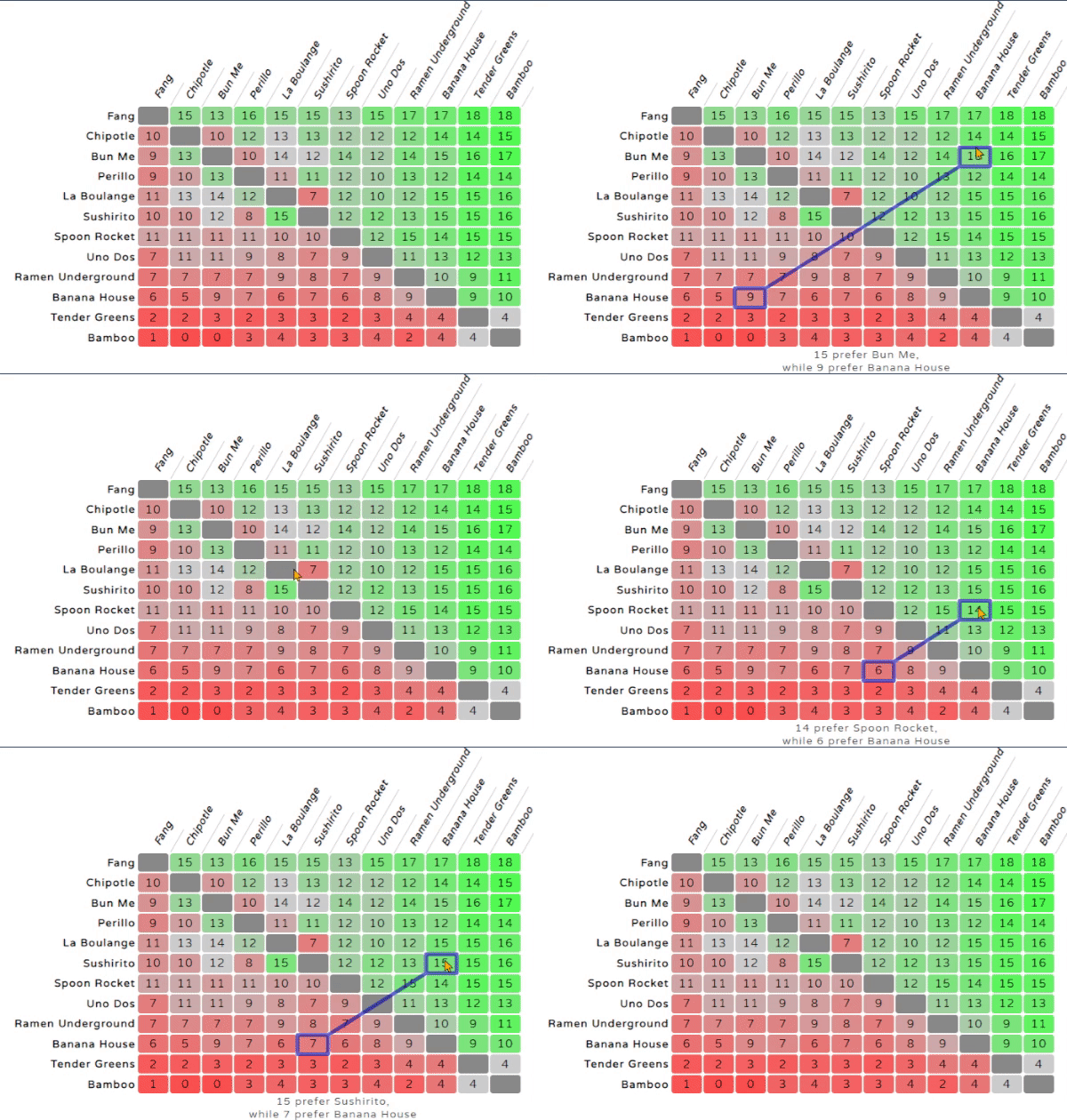
Traditionally we use a pairwise matrix to show results of a Condorcet-type election. The best I've been able to get this to look is this (using shades of green and red to show wins and losses, and sorting the candidates by pairwise wins):
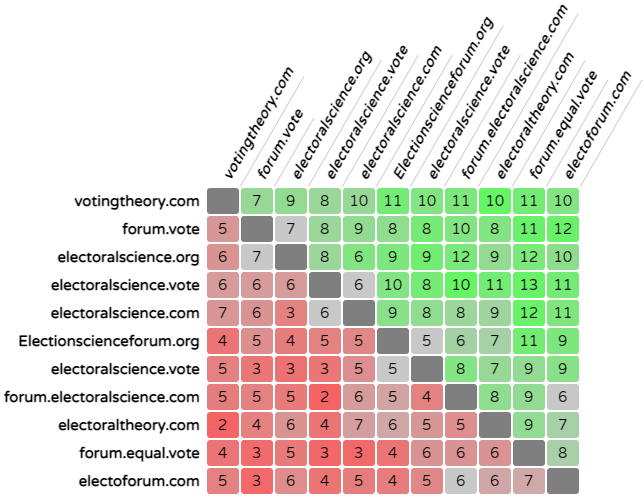
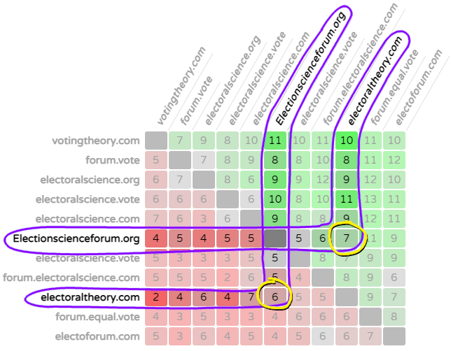
A problem with this is it isn't all that easy to look at and take in, even if you understand it conceptually. The big problem is that each candidate is listed twice (once along the top and once on the left), so see how two candidates did against each other pairwise you need to follow a lot of things with your eyes and try to connect them which is awkward and relies more on actual numbers than graphics (the shades of colors only goes so far):
Here's an alternative I am exploring, that is intended to communicate more graphically, in the same spirit as a bar or pie chart but still showing all the inter-candidate relationships. (has anyone seen anything like it?) Here it's shown with just 6 candidates, but it should be able to show a good bit more without looking too crowded.
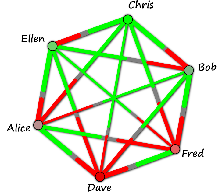
Chris is the Condorcet winner here, since all of the lines coming out of Chris's corner are green. Dave is the Condorcet loser, with all red. Ellen beat everyone except Chris pairwise (she has one red line coming out of her corner). In other words, the more green you see around a candidate, the better they did.
Of course, between two candidates, the number of candidates that prefer the winner is shown in green, the loser in red. (meaning the green part of a connector line will be longer than the red part of the same line) Those that rate them equally are shown in gray. Here is a simple explanation where the actual numbers are shown for a pair of candidates:
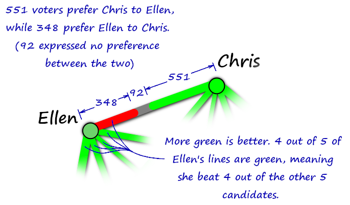
While the numbers probably wouldn't be shown by default, that information could still be available by showing a matrix to those who really want to see it that way. Or, something like this that works better in plain text (note that this example shows a 3 way tie for pairwise wins, and shows that -- for instance,-- a beat b by 307 to 258 voters):

I have various other thoughts on how the graphical one can best communicate. For instance we want the winners nearer the top, and the figure can even be rotated a bit to be able to have them better visually sorted. (such as how Ellen is slightly higher than Bob due to the rotation of the figure). You might also notice that the longer a connector line is, the thinner I make it, so they look visually balanced. (so, for instance, the "amount of green" between Chris and Bob is about the same as the amount between Chris and Dave)
Anyway, this is just a graphical mockup right now (not done programmatically) but if I get interest I may put it into a Codepen that can do it on real results, using either SVG or canvas, and allowing you to save an image or what-have-you.
-
@rob What if the winner and loser were next to each other on the circle and the rest were arranged by winnitude, with the runner-up close to the winner, and so on?
-
@jack-waugh So they are essentially sorted clockwise?
It can technically work in any sort order, but I personally prefer that winners be up and losers be down (i.e. sorted in the Y dimension). If you think of loser as being diametrically opposed to winner..... having them literally diametrically opposed makes more sense to me. (although I guess with an odd number of candidates they won't be precisely diametrically opposed, but still)
People aren't really supposed to be reading too much into the ordering. At a glance, they are supposed to think "green means good."
Still, I think it intuitively communicates better when you don't have sudden "jumps" within it, as you have when the winner and loser are adjacent, while in all other cases being adjacent means they are "close." But that is just me.
In any case if I get around to implementing this in code, it will be trivial to have it work that way as an option.
-
@rob You divide the candidates who are not at the extremes into two branches. This makes it harder for the reader to see them in order. A semicircle would be good, I think.
-
Anyway, yeah, I think the lines colored in segments like that are easier to read than a matrix.
-
@jack-waugh said in Alternative to pairwise matrix:
You divide the candidates who are not at the extremes into two branches.
Hmmm, yeah... I guess? I don't think of it that way, but I understand what you are saying.
The idea here is less about putting them into an order (although there is one.... top to bottom, ignoring right to left), but showing the individual pairwise relationships. I'm hoping that the "greener is better" logic will help people avoid seeing it in the way you are (as two branches).
A semicircle would basically double the issue with it getting crowded as you get more candidates. In the optimum scenario, all connector lines would be the same length, but that's impossible with more than three candidates. It's not bad with 6 candidates arranged in a circle (three different length lines, with the long ones twice as long as the short ones), but if you did it along a semicircle some lines would be very long and some very short.
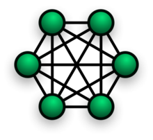
Anyway I thought it was interesting that this arrangement seems to be called a "fully connected mesh topology" in computer science / network science.
@jack-waugh said in Alternative to pairwise matrix:
Anyway, yeah, I think the lines colored in segments like that are easier to read than a matrix.
Cool, good to hear. To me it makes a dramatic difference in being able to look at it and instantly understand it.
-
The sign would seem to show carelessness not only about geometry, but also language. I don't know Spanish, but based on info from Google Translate, that should be "de los demás", not "de los demas".
-
@rob yeah, this is definetely an easier visual then those number-overload!
I think the easier graphics will allow more complexity in details because voters will feel they already undetsnd "enough" of it to feel good about it.
Most people don't try understanding every detail, just a good-enough-intuition. -
@multi_system_fan Thanks. I'm working on adding some new things that will make it better, as well as tie it to the more traditional pairwise matrix view. For instance I want to allow both this thing, and the pairwise matrix to appear side by side, and support mouse hover effects for both of them. (you could also just view one of the other)
I did some hover effects on the matrix some years back, but it would be especially cool if you could have the two things side by side, and when you hover over a pair of candidates on the matrix, or the connector line between the candidates on the "mesh" display, it would highlight relevant things in both graphics at once.
(this is for voting for restaurants, as we did at a previous job I had where they ordered lunch for us every day and we'd always waste time arguing about which one to get each day)
I'm convinced that allowing people to visualize this stuff quickly makes it less scary to them. Nobody wants to sort through tons of data, a picture can make a big difference.
A pairwise matrix without colors and hover effects / animation is extremely hard to make heads or tails of.... but all the better if you can show a simpler-seeming graphic that has each candidate on it only once.